
제품 출시 포스터
읽기 쉬운 헤드라인, 제품 히어로, 오퍼 영역, 완성도 높은 캠페인 구성이 있는 깔끔한 포스터를 만드세요.
글에서 이미지를 만들고 주제, 구도, 조명, 텍스트 규칙, 검토 목표를 더 명확히 하여 결과를 개선하세요. 아직 참조 이미지가 없을 때 적합합니다.

AI 이미지 생성기는 텍스트 프롬프트, 참조 이미지, 편집 지시를 새로운 시각 자료로 바꿉니다. 브라우저에서 사실적인 사진, 제품 목업, 포스터, 썸네일, 인물, 일러스트, UI 콘셉트, 소셜 그래픽을 만들 수 있습니다.
Toolaze는 무료 온라인 AI 이미지 생성기이자 모델 선택 허브입니다. 간단한 프롬프트로 시작하고 필요하면 참조 이미지를 업로드한 뒤, 텍스트 표현, 제품 연출, 이미지 편집, 빠른 변형, 상업용 레이아웃에 맞는 모델을 고를 수 있습니다.
제품 이미지, 이커머스 등록 이미지, 유료 광고, 소셜 게시물, YouTube 썸네일, 캠페인 콘셉트, 발표 자료, 캐릭터 아이디어, 디자인 참고, 클라이언트 리뷰용 초안에 활용하세요.
Toolaze로 만들 수 있는 결과를 살펴보세요. 마케팅 이미지, 제품 비주얼, UI 콘셉트, 교육 그래픽, 인물, 썸네일, 참조 기반 편집을 만들 수 있습니다.
읽기 쉬운 헤드라인, 제품 히어로, 오퍼 영역, 완성도 높은 캠페인 구성이 있는 깔끔한 포스터를 만드세요.

짧은 카피, 강한 대비, 명확한 혜택, 모바일 친화적 레이아웃의 눈에 띄는 소셜 광고를 생성하세요.

초기 디자인 탐색을 위해 앱 화면, 대시보드 패널, 온보딩 카드, 제품 기능 개요를 빠르게 스케치하세요.

제품 아이디어나 참조 이미지를 더 깔끔한 마켓플레이스 이미지, 라이프스타일 컷, 번들 비주얼, 시즌 리스팅 초안으로 바꾸세요.

명확한 주제, 표현력 있는 구도, 읽기 쉬운 짧은 문구, 강한 대비를 가진 썸네일 콘셉트를 만드세요.

학습 비주얼, 과학 다이어그램, 역사 설명 그래픽, 과정 차트, 섹션 라벨이 있는 수업 자료를 만드세요.

인물, 크리에이터 아바타, 캐릭터 아이디어, 프로필 이미지, 스타일 스터디, 스토리텔링 참고 비주얼을 생성하세요.

참조 이미지를 업로드하고 주요 피사체는 안정적으로 유지하면서 배경, 조명, 구도, 스타일을 바꾸세요.
몇 단계로 이미지를 만들고 더 명확한 프롬프트, 참조 이미지, 다른 모델로 결과를 개선하세요.

단계 1
자산 유형, 주제, 장면, 스타일, 분위기, 비율, 이미지에 표시할 텍스트를 설명하세요.

단계 2
제품, 얼굴, 물체, 포즈, 레이아웃, 방, 스케치, 시각 방향을 유지하고 싶을 때 참조 이미지를 추가하세요.

단계 3
텍스트 이미지 생성, 이미지 편집, 제품 비주얼, 소셜 광고, 빠른 변형 등 작업에 맞는 모델을 선택하세요.

단계 4
이미지를 공개적으로 사용하기 전에 텍스트 철자, 얼굴, 손, 브랜드 문구, 제품 디테일, 구도를 확인하세요.

단계 5
프롬프트의 한 부분씩 조정하고, 필요하면 모델을 바꾸거나 더 좋은 참조 이미지를 업로드해 제어력을 높이세요.
비즈니스 자산, 크리에이터 콘텐츠, 디자인 탐색, 빠른 클라이언트 검토를 위해 아이디어를 시각 초안으로 바꾸세요.
제품 출시 포스터, paid social 콘셉트, 이커머스 목업, 패키징 아이디어, 시즌 캠페인 이미지를 생성하세요.
YouTube 썸네일, TikTok 커버, Instagram 그래픽, 크리에이터 게시물, 반응 이미지, 공유용 포맷을 만드세요.
프로필 콘셉트, 캐릭터 시트, 스타일화된 인물, 아바타, 참고하기 쉬운 창작 방향을 만드세요.
이벤트 포스터, 인용 그래픽, 프레젠테이션 커버, 편집형 레이아웃, 짧은 텍스트 중심 디자인을 초안으로 만드세요.
앱 화면, 랜딩 페이지 비주얼, 브랜드 무드보드, 기능 그래픽, 초기 디자인 방향을 탐색하세요.
텍스트로 시작하거나 참조 이미지를 업로드한 뒤 배경, 스타일, 조명, 구도, 사용 목적을 바꾸세요.
인포그래픽, 수업용 다이어그램, 과정 비주얼, 학습 보조 자료, 라벨이 있는 차트, 발표용 교육 그래픽을 만드세요.
제품 사진 편집, 배경 변경, 실내 스타일 변경, 조명 개선, 변형 생성, 거친 참조를 완성도 높은 초안으로 바꾸세요.
프롬프트를 복사해 생성기에 붙여넣고 주제, 브랜드 스타일, 형식, 모델을 자신의 이미지에 맞게 조정하세요.
Create a premium product launch poster for a fictional sparkling water brand called "Luma Fizz". Show one can as the hero product, cold condensation, citrus slices, bright studio lighting, clean white and indigo background, readable headline text "FRESH SPARK", small subtitle "Citrus sparkling water", polished commercial ad layout, 4:5 vertical poster.

Create a bold YouTube thumbnail for a video titled "5 AI TOOLS I USE DAILY". Use a clean tech background, one expressive creator portrait, five floating app-style cards, large readable text, strong contrast, bright rim lighting, modern creator economy style, 16:9 composition.

Create a square social media ad for a productivity app. Show a clean phone mockup with a simple task dashboard, a bright desk scene, and the headline "Plan Your Day in Minutes". Use friendly modern typography, high contrast, and a layout that works on mobile feeds.

Use the uploaded product photo as the reference. Preserve the product shape, logo placement, and camera angle. Change only the background into a premium marble bathroom scene with soft daylight, clean reflections, luxury skincare styling, and natural shadows.

Create a clean ecommerce product image for a reusable water bottle. Show the bottle standing upright on a white background with soft shadows, three small feature callouts, and a premium marketplace-ready look. Keep the image uncluttered and realistic.

Create a modern SaaS analytics dashboard mockup for a fictional product named "PulseDesk". Include readable labels, left sidebar navigation, three metric cards, a line chart, a campaign table, calm white background, indigo accent color, realistic product UI screenshot style.

Create a character reference sheet for an original adventure game courier named Mira. Show front view, side view, back view, three facial expressions, one backpack prop, color palette, and clothing details. Keep the same character identity across every panel.

Create a clear educational infographic explaining how solar panels work. Include labeled sections for sunlight, photovoltaic cells, inverter, battery, and home power. Use simple icons, readable short labels, clean spacing, friendly science classroom style.

대부분의 사용자는 빠른 탐색에는 텍스트 이미지를 사용하고, 더 많은 제어가 필요할 때 이미지 투 이미지로 이동합니다. Toolaze는 두 워크플로와 모델 선택을 함께 제공합니다.
장식용 이미지를 넘어 실제 작업물이 필요할 때 Toolaze를 사용하세요. 프롬프트 기반 비주얼, 참조 편집, 모델 비교, 마케팅/제품/디자인/교육/콘텐츠용 이미지 초안을 만들 수 있습니다.

작성한 프롬프트를 새 이미지로 변환합니다. 주제, 스타일, 레이아웃, 배경, 조명, 비율, 이미지 안에 들어갈 정확한 문구를 설명하세요.


이커머스 제품 이미지, 마켓플레이스 초안, 라이프스타일 장면, 패키지 목업, 시즌 제품 비주얼, 깔끔한 제품 히어로 이미지를 만드세요.


YouTube 썸네일, 블로그 히어로, 소셜 게시물, 크리에이터 그래픽, 프로필 콘셉트, 스크롤을 멈추게 하는 시각 후크를 만드세요.

이미지 모델마다 잘하는 작업이 다릅니다. 읽기 쉬운 텍스트, 제품 이미지, 참조 편집, 빠른 변형, 완성도 높은 디자인 초안, 창의적 탐색 등 출력 목표에 맞춰 선택하세요.
깔끔한 텍스트 이미지 프롬프트, 읽기 쉬운 짧은 문구, 포스터, 제품 광고, UI 목업, 상업용 그래픽에 적합합니다.
GPT Image 2 사용해 보기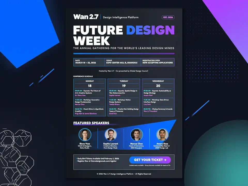
구조화된 프롬프트, 다중 참조 편집, 텍스트가 많은 레이아웃, 프롬프트 추론, 이미지 세트에 적합합니다.
Wan 2.7 Image 사용해 보기
고품질 이미지 생성, 참조 편집, 인물, 제품 샷, 완성도 높은 캠페인 초안에 적합합니다.
Nano Banana Pro 사용해 보기
빠른 일상 이미지 생성, 창의적 변형, 다양한 비율, 이미지 투 이미지 초안에 적합합니다.
Nano Banana 2 사용해 보기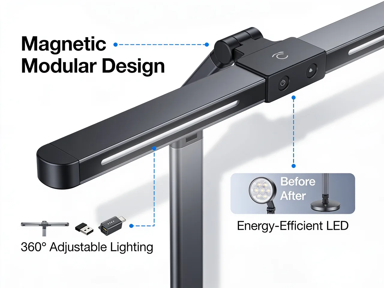
상업용 제품 비주얼, 타이포그래피 중심 레이아웃, 프롬프트 준수, 브랜드 스타일 구도에 적합합니다.
Seedream 4.5 사용해 보기가벼운 이미지 생성 workflow, 캠페인 아이디어, 이미지 초안, 빠른 크리에이터 실험에 적합합니다.
Seedream 5.0 Lite 사용해 보기편집, 압축, 변환, 모델 비교가 필요하면 전문 모델 페이지나 다른 Toolaze 도구로 이어가세요.
이미지, 비디오, 글쓰기, 생산성, 창작 workflow를 위한 더 많은 AI 도구를 살펴보세요.
AI 도구 보기작업, 출력 스타일, 모델 계열, 창작 workflow별로 Toolaze 이미지 및 비디오 모델을 비교하세요.
모델 보기참조 이미지를 업로드하고 편집 내용을 설명해 제어된 변형, 제품 컷, 배경 교체, 스타일 변경을 만드세요.
이미지에서 편집GPT Image 2로 포스터, 제품 광고, 읽기 쉬운 텍스트, UI 목업, 구조화된 이미지를 만드세요.
GPT Image 2 사용해 보기텍스트가 많은 이미지, 제품 비주얼, UI 목업, 캠페인 레이아웃을 위한 프롬프트 구조를 살펴보세요.
프롬프트 열기제품 출시, 소셜 캠페인, 유료 크리에이티브, 썸네일 콘셉트를 위한 광고 프롬프트 템플릿을 사용하세요.
광고 보기다운로드한 AI 이미지를 JPG, PNG, WebP, HEIC 형식으로 변환해 게시 workflow에 맞추세요.
이미지 변환생성 이미지를 웹 게시, 이커머스 등록, 소셜 업로드, 빠른 페이지 속도에 맞게 압축하세요.
이미지 압축프롬프트, 크레딧, 이미지 속 글자, 참조 이미지, 상업용 초안에 대한 답변입니다.
주제, 장면, 스타일, 조명, 구도, 형식, 짧은 표시 문구를 설명해 새 이미지를 만드는 도구입니다.
신규 사용자는 가입 후 무료 크레딧 20개를 받습니다. 생성 가능 수는 모델과 해상도에 따라 달라지며 실행 전에 정확한 비용이 표시됩니다.
에셋 유형, 주제, 배경, 스타일, 조명, 구도, 화면비, 정확한 문구, 최종 용도를 적으세요.
짧은 문구가 더 안정적입니다. 정확한 문구를 따옴표로 쓰고 위치를 지정한 뒤 게시 전에 철자를 확인하세요.
실제 제품, 얼굴, 포즈, 방, 패키지, 기존 구도를 알아볼 수 있게 유지해야 할 때 사용하세요.
권리, 브랜드, 플랫폼, 법적 요구사항을 충족하면 상업용 초안으로 쓸 수 있습니다. 게시 전에 최종 이미지를 검토하세요.
Toolaze AI Image Generator로 텍스트에서 이미지를 만들고, 참조 이미지로 편집하고, AI 모델을 비교하며 제품, 광고, 썸네일, 소셜, 교육, 디자인용 실용 비주얼을 제작하세요.
텍스트 이미지 시작